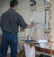
 Yesterday I had the good fortune to see a demo by Armand Cabrera (blog), the San Francisco artist who now lives in Warrenton, VA. He was hosted by Vienna Arts Society, a very active group with many opportunities for exhibiting and education. (Oh, yes, I'm very tempted to join, as if I didn't belong to enough!) I have coordinated with him to do an en plein air demo at the Manassas Battlefield (between the Visitor's Center and the Henry House) May 16 at 10am through NOVAL.
I'll write about his demo in the next few days, but I still have much more to relate about Kenn Backhaus. First, however, I must recognize Ayr Hill Gallery in Vienna, as Gail Roberts' collection is spectacular. She has a number of Backhaus' and Cabrera's works. Because I'd only seen the demo/plein air version of Backhaus', it was revealing to see his works on on a much larger scale, which followed his same square format; there was also some portraiture, which did not. Additional artists that caught my eye were Ann McMillian and Jake Erickson. Although I could not find a site for Erickson, McMillian has an online gallery as well as a blog, her working in both pastel and oil. They both had light and loose landscapes on smaller scales on Ayr Hill. No wonder I appreciated them.
 Kenn Backhaus' demo last weekend was a great way to see him interact with his own paint. Watching him do a critique of others' paint taught me even more. Here I will combine bits of his wisdom from last weekend.
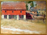
This piece was painted on Saturday during the Paint Out. Another piece sold during the Wine and Cheese Reception. In all, nine artists had paintings sell that first night.
I'll bullet some of his points and hopefully they'll make sense overall.
- contrast shape, value, and color
- don't drop your gear at the first site you encounter; walk around and seek a better spot and look at where other artists are to figure out what drew them there
- don't worry about the proper number of windows, doors, etc, except for a commission
- pat your back pocket; that's your artistic license
- think of the canvas as having a main character with other supporting actors; they guy who is supposed to quietly walk though a scene should not come out with a shouting part
- concentrate on your focal point, your main character; the rest should have soft edges and not be competing elements
- seek a lack of balance, for example 5% light/95% shadow or 10% shadow/90% light (Harley Brown's book has great visuals for this)
- insists that darks should connect
- he starts with either an overall foundation or he develops the focal point first; he does not suggest painting individual elements in succession, because that makes the supporting actors too important
- a stickler for things to not be in the middle, he marks the center axis horizontally and vertically so he avoids them in composition before his pencil drawing
- looks to make sure there are places for eye relief, that the composition isn't too busy
- palette is cad lemon, cad yellow lt, raw sienna, permanent rose, alizarin crimson, ultramarine blue, ivory black
- uses OMS and no medium outside, but experiments with mediums in the studio
- #8 filbert is his workhorse brush
- darkens darks instead of "whiting out" light areas
- seek contrasting values, especially your focal point; aim for the focal point to have the most constrasts
- don't stairstep your trees/composition or make bookends at the front
- lower the clouds in a composition which is looking up
- likes CA sky painters like Edgar Payne, Maynard Dixon, Charles Hassum, _ Metcalf (will research and link)
- buys rolls of Claessens linen #17 and mounts on gatorboard or birch
- stretches anything larger than 20x24
- uses such a variety of brush strokes that his brush is at all angles (see videos)
- when painting highlights, are brighter toward the top of the building than the bottom
- to do a long corner highlight, load a small brush and drag it upside down, letting the brush do its thing with broken lines, then pressing a bit more toward the top
- incorporating new light will alter the original composition and darks connecting
- ambient light from the sky is cool, sunlight is warm
- imagine a white canvas held perpendicular to the setting sun; the surface is very warm. Change the direction of the the canvas to be less angled and this is cool. Aim the canvas upward, perpendicular to overhead to the ambient light, and it is very cool; think of these temperatures whe you determine reflections
- don't split shape in half them laying down a path or stream, seek the asymmetrical, do not do a yin/yang
- be sure that whatever you have in a scene can be accurately perceived by the viewer
- sky is lightest; ground is next lightest; trees in the distance are darker
- seek an economy of color and economy of strokes, which implies confidence
- his brushstrokes are varied in every direction (see the videos)
- juxtapose thin/fat, dark/light, cool/warm because nature is random
- scrape into the oil paintings with a palette knife to let in air


4 comments:
Thanks again, Bonnie. I wish I had been at this demo but it's very helpful to read your notes. Hopefully some of this will sink in. I already have a filbert brush - to brush off my goofed-up pastels areas :-)
Thank you for those notes! I am so very proud of you and glad that you are using your talents.
Donna, I am so intuitive and right-brained that rules can make me glaze over. His presentation and critique, although I'd heard pieces and parts before, brought so much home. Before the critique, I was agog with the talent of the other incredible artists; after, I wondered why I didn't see the obvious errors (usually things along the midlines or in the middle) before. Sometimes it feels best to paint from the gut and say rules schmules, but it's way cool when the rules come together to make sense.
Thanks, Julianna. I am so lucky to have this much available to me here. Annual dues are killers, especially in January, but most are well worth it.
Thanks Bonnie for the wonderful synopsis of Ken's Demo... i love the bulleted format. Alot of them resonated with how i feel about plein air...it was fun to think, "Yeah, I do that!" or "Good idea" as I read through them. Love the squint tip...i had an amazing illustration teacher in college and he made us squint and critique our work at every step and it helped me alot. I need to remember to do that more!
It has been so rewarding to get to know you and others through MAPAPA. You inspire me with your calm ease and approach to your work. I really enjoyed looking at your work on line... especially the sky work (ala sperlak) beautiful!
Thanks again for sharing the demo..i wanted to stay but couldn't. As it turns out we never made it to CA...so no painting trip. Extreme bummer but probably more so for my daughter. She got in the way of her horse's kick, shattered elbow, open fracture, ER sugery and 8 weeks recovery ahead. But she will be ok and get all the use back in her arm...so I am grateful. Even more thankful because she raised her arm to shield her face, so the elbow took the hit.
Life's ebb and flow...grace and strength keep us going.
See you at the next paint out!
Jane
Post a Comment